
Cronometer Brand Evolution: New Icon & Target Visualizations
Nutrition has never been more visible. Every day, we’re surrounded by health advice, food trends, wellness influencers, wearable data, and endless opinions about what we should eat. Yet for all this information, many people still feel stuck. Not because they don’t have enough data. Because they don’t have enough understanding.
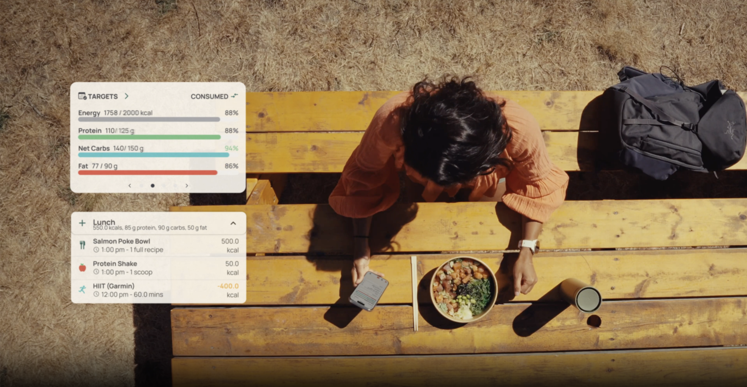
That’s a challenge we’ve been thinking about a lot lately. For sixteen years, Cronometer has helped people access accurate nutrition data. Today, we’re taking the next step in that journey with a refreshed brand icon and updated Target Visualizations, improvements to how nutrition targets are displayed and interpreted throughout the app, designed to make nutrition data easier to understand.
This isn’t a reinvention. It’s an evolution. A reflection of how Cronometer has grown, how our community has grown, and where we’re headed next.

The World Has Changed. Our Mission Hasn't.
When Aaron Davidson created Cronometer in 2005, nutrition tracking looked very different than it does today.
Most tools focused primarily on calories. Food databases were often incomplete. Micronutrients were largely overlooked. And understanding how nutrition impacted your health often required piecing together information from multiple sources.
Cronometer took a different approach. We believed people deserved access to accurate nutrition data. Not estimates. Not shortcuts. Not oversimplified nutrition data that hid the details. Real nutrition data people could trust.
That commitment attracted a remarkably diverse community over the years. Professional athletes. Healthcare practitioners. People managing chronic conditions. Parents. Researchers. High performers. People simply trying to feel their best.
Different goals. Different lifestyles. Different definitions of health. But they all had one thing in common. They wanted more than numbers. They wanted understanding.
And today, that need is greater than ever.

Building Toward a Better Understanding of Nutrition
Over the last decade, we’ve gained access to more health data than ever before. We can track sleep, heart rate, recovery, glucose, exercise, stress, and nutrition. But data alone doesn’t create confidence. Understanding does. The challenge isn’t access to information anymore.
It’s making sense of it. That’s why this evolution is about more than a new logo or refreshed visuals. It’s about building a brand and product experience that helps people better understand what their data means and how it connects to their goals.
The refreshed brand icon and updated Target Visualizations are part of that journey.
They represent an early effort to bring greater alignment between what Cronometer stands for and how the product experience continues to evolve.
Because when people better understand their nutrition, they’re better equipped to make informed decisions. And informed decisions build confidence over time. That’s the future we’re working toward.
Why We're Evolving the Cronometer Brand
A brand should reflect who you are. And after two decades of growth, Cronometer has evolved.
Our community has grown. Our product has grown. The role we play in people’s lives has grown.
This evolution reflects that growth while staying true to what has always made us different. At the center of the refreshed identity is a symbol that’s been part of Cronometer from the beginning: the target.

"For nearly twenty years, our goal has been to help people make informed decisions through accurate nutrition data. As health technology continues to evolve, we're focused on making that information easier to understand, more meaningful, and more useful in everyday life. This evolution reflects where we're headed and the experience we want to continue building for our users."
— Aaron Davidson, Founder & CEO
More Than a New Look
A logo can’t make nutrition easier to understand. But it can reflect the values and direction behind the experiences we build. For us, this evolution isn’t about changing who we are.
It’s about creating greater alignment between our brand, our product, and the experience we want people to have when they use Cronometer. The refreshed identity reflects the future we’re working toward. One where accurate nutrition data isn’t just available, but easier to understand and more meaningful in everyday life.
You’ll see that philosophy reflected in the updates we’re introducing today, including our updated Target Visualizations, improvements to how nutrition targets are displayed and interpreted throughout the app, and in the experiences still to come. The refreshed identity signals where we’re headed. The product is where that vision comes to life.
Why the Target Still Matters
The target has always represented something deeply personal. For one person, it might mean managing blood sugar more effectively. For another, it could mean improving athletic performance. For someone else, it might mean supporting healthy aging, building muscle, improving fertility, increasing energy, or simply feeling better day to day.
The goal is different for everyone. And that’s exactly why the target remains. Cronometer has never believed there is one right way to approach health.
We don’t prescribe identities. We don’t promote nutrition ideologies. And we don’t define success for our users. Instead, we provide accurate, objective nutrition insights that help people make informed decisions based on their own goals, values, and priorities.
The refreshed target brings that philosophy into sharper focus. It’s cleaner. More adaptable. More modern. But its meaning remains the same. Helping people aim for what matters most to them with confidence.

Nutrition Without Judgment
From the beginning, Cronometer has taken an objective approach to nutrition. We’ve always believed people deserve accurate information they can use to make informed decisions for themselves.
That belief continues to guide how we build the product today. Because food is personal. It’s connected to culture, family traditions, celebrations, comfort, performance, identity, and everyday routines. Yet nutrition is often framed in ways that encourage guilt, shame, or rigid thinking. People are frequently made to feel like they’re eating “right” or “wrong.”
We believe there’s a better approach. Nutrition data should help people understand. Not moralize. Not criticize. Not oversimplify. Just inform.
That philosophy doesn’t stop at our brand. It’s also influencing how we think about the product experience itself. One of the first examples is our updated Target Visualizations.
A More Thoughtful Way to Understand Your Data
One of the first places you’ll see this thinking show up is in our updated Target Visualizations, improvements to how nutrition targets are displayed and interpreted throughout the app. While relatively small on their own, these changes reflect a larger shift in how we’re approaching product design.
We’re asking a simple question: How can we make nutrition information easier to interpret without sacrificing accuracy?
These updates are designed to create a clearer, calmer, and more intuitive experience when reviewing your nutrition data.

More Neutral Fat Visualizations
Fat is an essential nutrient. Certain visual treatments could unintentionally resemble warning indicators, even when users were simply reviewing their data.
Updated visualizations now use more balanced, brand-aligned color systems that support objective interpretation while maintaining clarity.
Improved Saturated and Trans Fat Target Logic
Some nutrients previously defaulted to targets of 0g, which could create confusing visual feedback.
Updated target logic better reflects nutritional context while still allowing users to customize targets based on their personal goals.
Clearer "No Target" States
Not every nutrient tracked in Cronometer has an established recommended intake target.
Components such as cholesterol, oxalate, alcohol, and insoluble fiber don’t currently have official Dietary Reference Intake targets. Those nutrients are labeled No Target because there isn’t a universally established goal to compare against.
The updated experience makes it easier to distinguish between:
- No value logged
- Value logged without an established target
- Value logged with a target
This creates a more transparent experience and helps users better understand what they’re seeing.

Designed With Our Community
Cronometer has always been shaped by the people who use it. Our users care deeply about nutrition. They ask thoughtful questions. They notice details. And they consistently challenge us to build better tools.
Many of the ideas that influence how we think about the product come from conversations with our community.
One recent example was our Reddit AMA, where users shared thoughtful feedback, asked challenging questions, and helped us better understand how people use Cronometer in their daily lives.
Those conversations continue to shape how we think about the product, the brand, and the experiences we build. That’s one of the things we love most about the people who use Cronometer. They don’t just track their nutrition. They seek to understand it.
And in many ways, that shared pursuit of understanding continues to shape the future of Cronometer. Because understanding isn’t something we create alone. It’s something we build together. Every piece of feedback helps us improve how we communicate nutrition science and how we design experiences that make that science easier to understand.
This Is Just the Beginning
The refreshed identity is a milestone. The updated Target Visualizations are one example of that evolution taking shape inside the product. Together, they represent something bigger than a visual update. They reflect a shared direction.
A direction guided by a simple belief: Accurate data is essential. But understanding is what helps people take action. The refreshed brand icon and updated Target Visualizations are early steps in that journey. And you’ll continue to see that philosophy shape how we design products, communicate insights, and build new experiences in the years ahead.
For sixteen years, Cronometer has helped people better understand their nutrition through industry-leading accuracy and personalization.
This next evolution reflects the same mission that has guided us from the beginning: Helping people make informed decisions through accurate, objective nutrition insights. The way we look may be changing. The reason we exist is not.
And we’re just getting started.
Frequently Asked Questions

Why did Cronometer update its brand icon?
Cronometer updated its brand icon to better reflect the company’s evolution and future direction. The refreshed identity maintains the familiar target symbol while creating stronger alignment between the brand and the product experience.
Is Cronometer changing its mission?
No. Cronometer’s mission remains the same: helping people make informed decisions through accurate, objective nutrition insights.
What changed in the Target Visualizations?
The updated Target Visualizations introduce more neutral nutrient displays, improved saturated and trans fat target logic, and clearer “No Target” states to make nutrition information easier to interpret.
Why are some nutrients labeled “No Target”?
Some tracked components, such as cholesterol, oxalate, alcohol, and insoluble fiber, do not currently have official Dietary Reference Intake targets. These nutrients are labeled “No Target” because there is no universally established intake goal for comparison.
Are more product updates coming?
Yes. The refreshed brand icon and Target Visualization updates represent an early step in Cronometer’s ongoing efforts to create a more intuitive and informative nutrition experience.
Ready to Experience the New Cronometer?
Download Cronometer for free and explore the latest evolution of Cronometer.
We’re excited to share what’s next.

About the Author
Keshia Blake
Brand & Communications Specialist, Cronometer
Keshia helps translate nutrition science into clear, human-centered stories that empower people to better understand their health. Her background spans healthcare, health behaviour change, advertising, creative strategy, and brand communications.
Citation Page
- National Academies of Sciences, Engineering, and Medicine. Dietary Reference Intakes: The Essential Guide to Nutrient Requirements.
- U.S. National Institutes of Health, Office of Dietary Supplements. Dietary Reference Intakes (DRIs): Recommended Intakes for Individuals.
- Health Canada. Dietary Reference Intakes Tables.