The Thinking Behind Cronometer's Updated Target Visualizations
When we shared Cronometer’s recent brand evolution, one of the changes people noticed right away was the updated Target Visualizations. We’ve loved seeing the conversations across social media, Reddit, and support. Many of you had thoughtful questions about the new color system and what changed.
So we wanted to take you behind the scenes. Because while the colors may look different, the thinking behind them has always been the same: helping you better understand your nutrition.

Good Design Should Help You Understand, Not Just Look Different
When people think about design, it’s easy to focus on how something looks. But for us, design is about how information is understood. Every chart, graph, target, and visualization in Cronometer exists to help you interpret your nutrition data with greater confidence. As our product continues to evolve, we want every visual decision to support that goal. Not simply by making the app feel more modern, but by making your data easier to understand.
Color Is Information
Color does more than make an interface look appealing. It helps people recognize patterns, identify relationships, and quickly understand what they’re seeing. But color can also communicate things we never intended.
Certain visual treatments can unintentionally feel like warnings, rewards, or indicators of success and failure, even when someone is simply reviewing their nutrition. As we revisited our Target Visualizations, we wanted to make sure the colors were communicating relationships, not judgments. That thinking shaped every decision we made.
Helping Energy Make More Sense
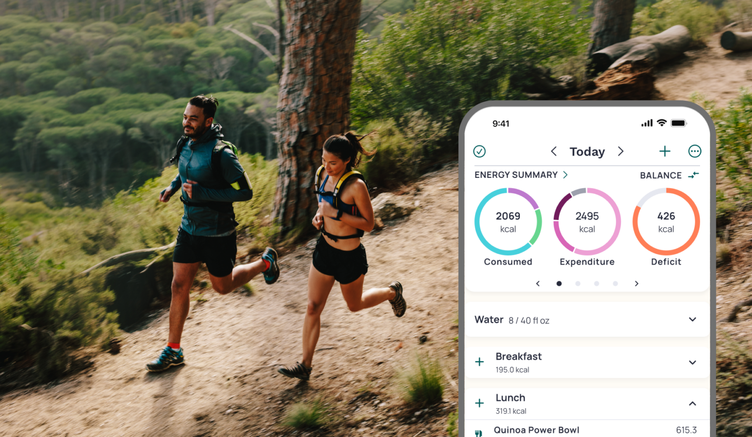
One of the biggest updates involves how energy expenditure is displayed.
Previously, Basal Metabolic Rate (BMR) and Baseline Activity, each used separate colors, while Activity Tracker Calories and Exercise were both the same color making distinguishing expenditure difficult to understand without looking at the legend or values in the diary.
The updated system groups these components within a shared color family while using four different tones to distinguish each contributor. The colors are not intended to represent importance, performance, or the number of calories burned. Instead, they help show that these metrics are all part of the same energy expenditure system while making it easier to identify the unique role each one plays.
These components include:
- BMR – the energy your body needs to support basic life functions at rest.
- Baseline Activity – routine movement throughout your day.
- Activity Tracker Calories – movement captured by your connected activity tracker.
- Exercise – deliberate physical activity you’ve logged or imported.
Together, they provide a more complete picture of how your body uses energy throughout the day.

Nutrition Without Judgment
The same philosophy guided our nutrient visualizations. Food is deeply personal. It’s connected to culture, family traditions, health conditions, athletic performance, celebrations, and everyday life.
We never want the interface itself to imply that a nutrient is “good” or “bad.” Some previous color treatments could unintentionally resemble warning indicators, even when users were simply reviewing normal dietary intake. The updated color system is designed to reduce those unintended associations while maintaining clarity and supporting a more objective interpretation of nutrition data.
Our goal isn’t to tell you what to think. It’s to help you better understand what you’re seeing.
Accessibility Matters
We also wanted to make the experience more accessible. The updated visual system is designed so that color isn’t the only way information is communicated.
Labels, values, layout, hierarchy, and progress indicators all work together to support interpretation, including for people with different forms of color vision deficiency. Because better understanding should be available to everyone.
We're Still Listening
One of the things we value most about the Cronometer community is that you notice the details. You ask thoughtful questions. You share honest feedback. And you help us build a better product.
The conversations we’ve seen since launching these updates have already helped shape how we think about communicating future product changes. We’ll continue listening, learning, and refining as Cronometer evolves. Because understanding isn’t something we build alone. It’s something we build together.

Continue the Conversation
If you haven’t yet read the story behind Cronometer’s recent brand evolution, you can explore it here: Built on Accuracy. Designed for Understanding. Why Cronometer Is Evolving
Together, these updates reflect a broader direction for Cronometer: helping people move beyond tracking and toward understanding.
Ready to Experience the New Cronometer?
Download Cronometer for free and explore the latest evolution of Cronometer.
We’re excited to share what’s next.

About the Author
Keshia Blake
Brand & Communications Specialist, Cronometer
Keshia helps translate nutrition science into clear, human-centered stories that empower people to better understand their health. Her background spans healthcare, health behaviour change, advertising, creative strategy, and brand communications.
Citation Page
- Ware, C. Information Visualization: Perception for Design. Morgan Kaufmann.
- Norman, D. The Design of Everyday Things. Basic Books.
- World Wide Web Consortium (W3C). Web Content Accessibility Guidelines (WCAG) 2.2.